Quinn's Concrete: Self initiated project
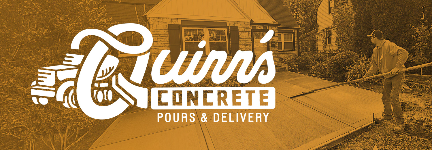
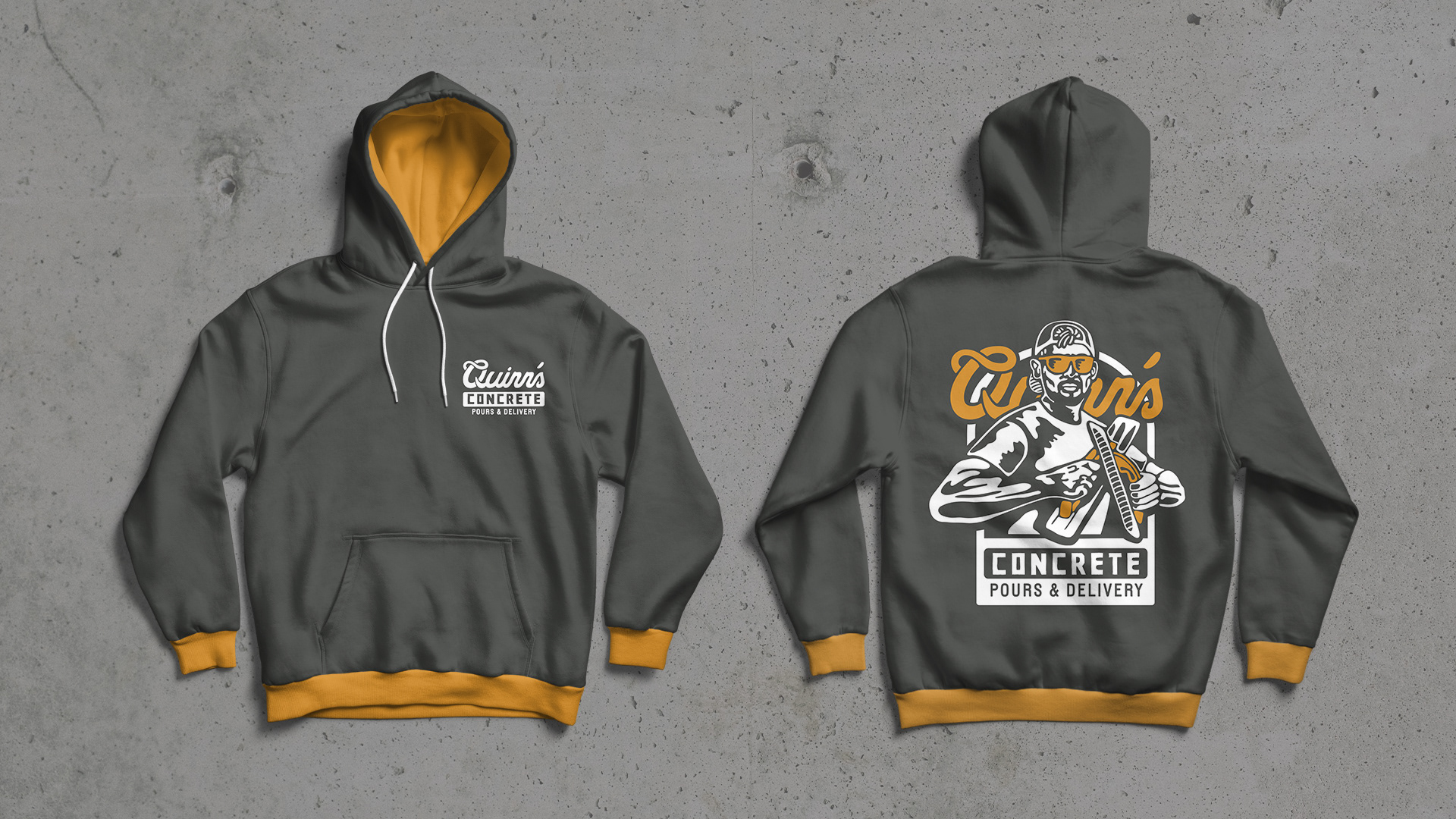
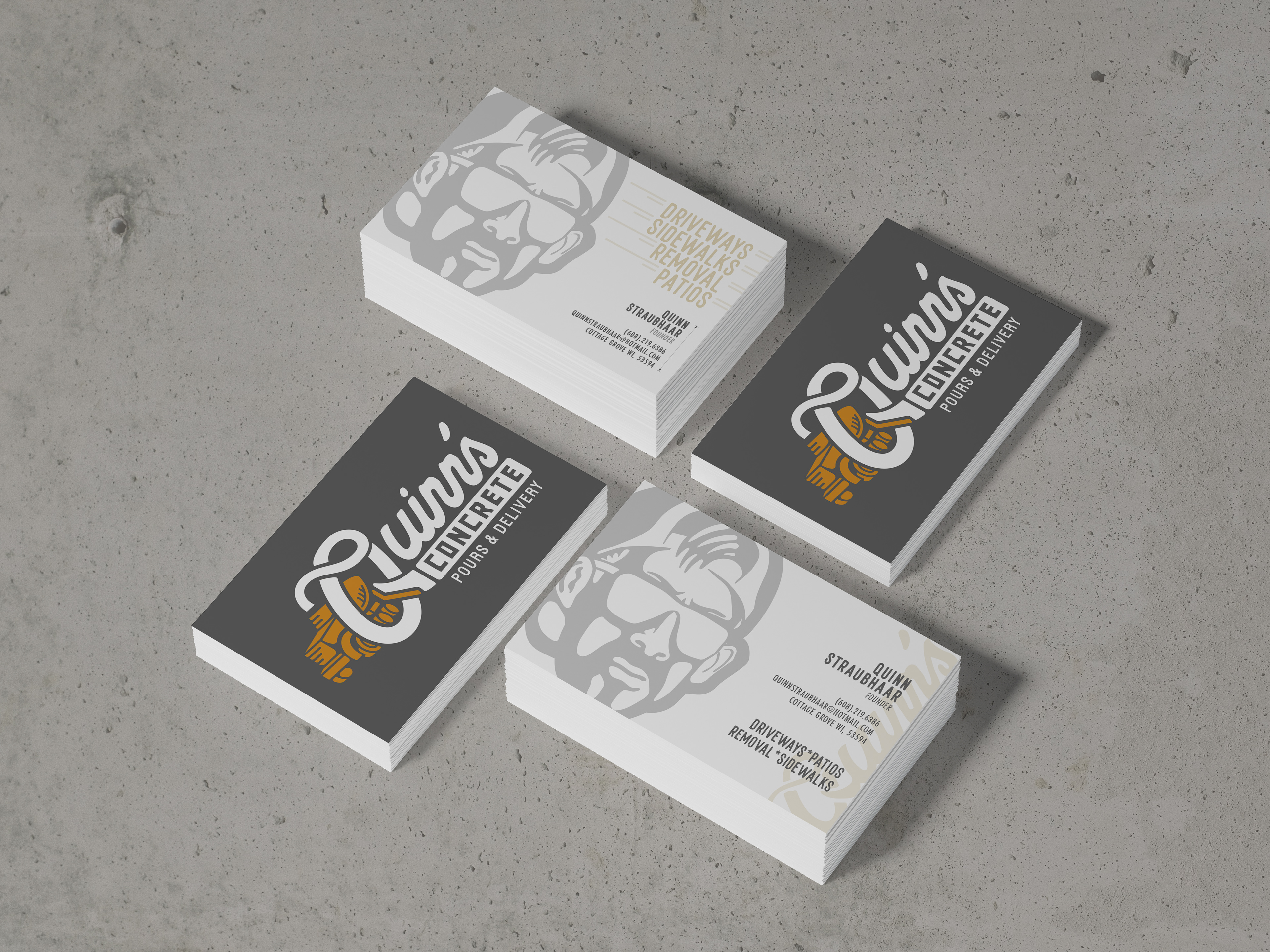
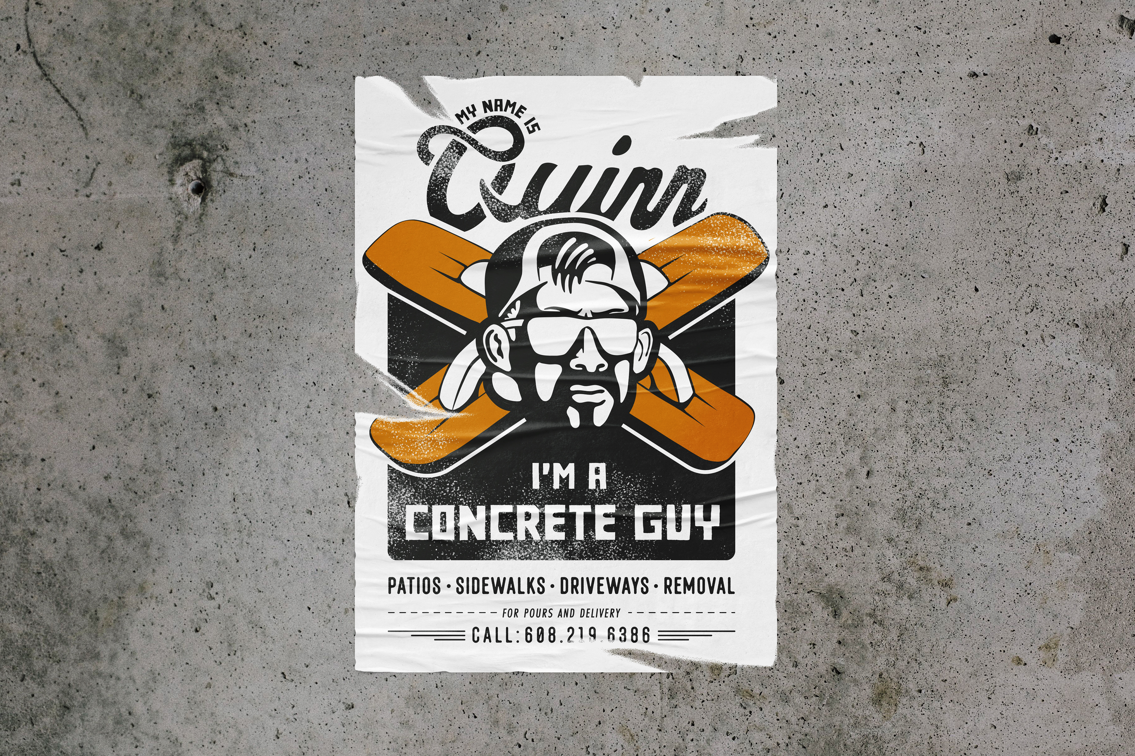
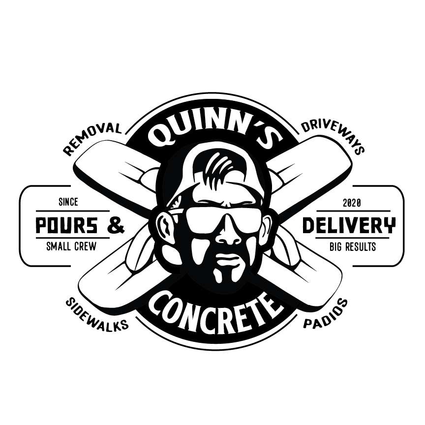
I created a logo and promotional poster for my brother’s concrete business. The logo design was inspired by a powerful pose he struck in a photo, which I stylized into a bold, graphic silhouette to represent strength and reliability—qualities important in the concrete industry.
Sketches
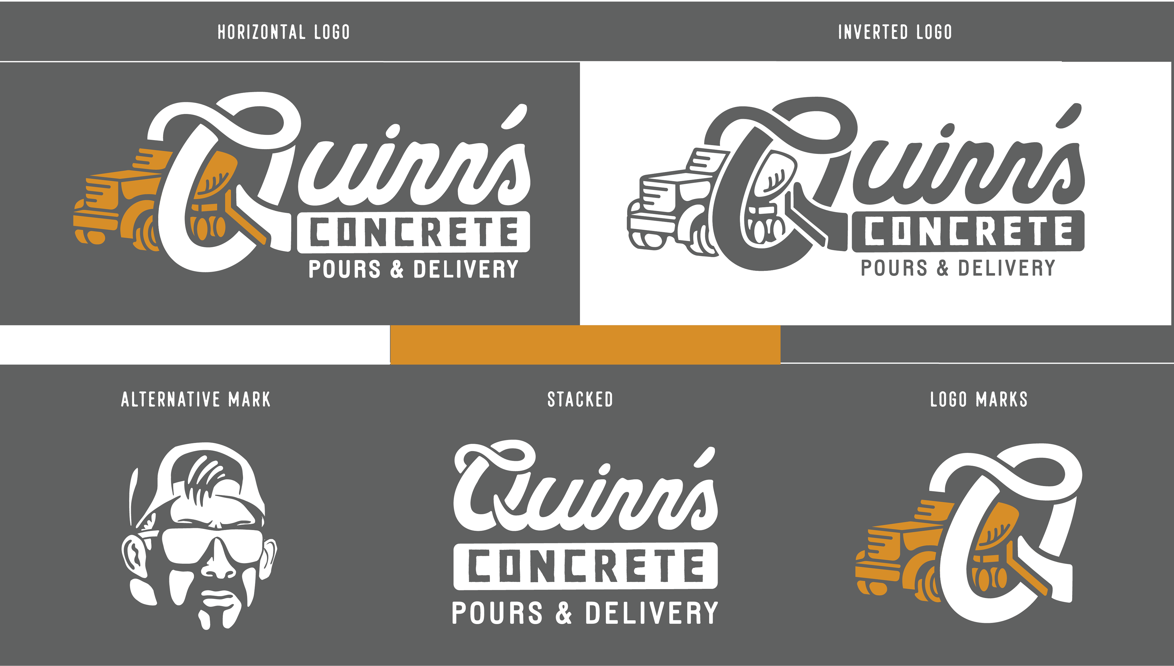
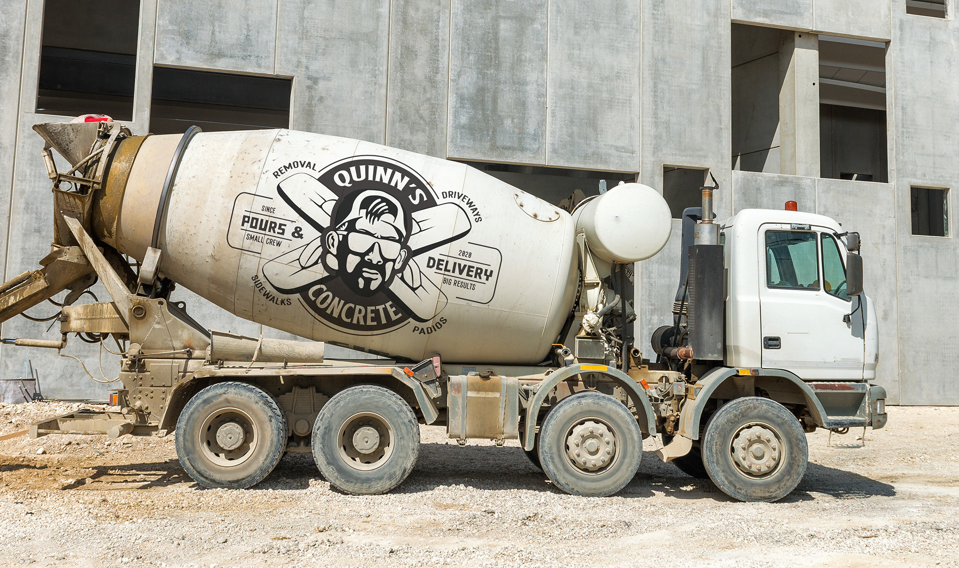
This section highlights my process of integrating custom typography, my brother’s character design, and elements of the concrete trade into a cohesive set of logo assets. I focused heavily on the hand trowel, as it mirrors the powerful pose that best captures his presence. Additionally, I wanted to incorporate his concrete truck—a significant symbol of pride and ownership that anchors the brand's identity.

My Process
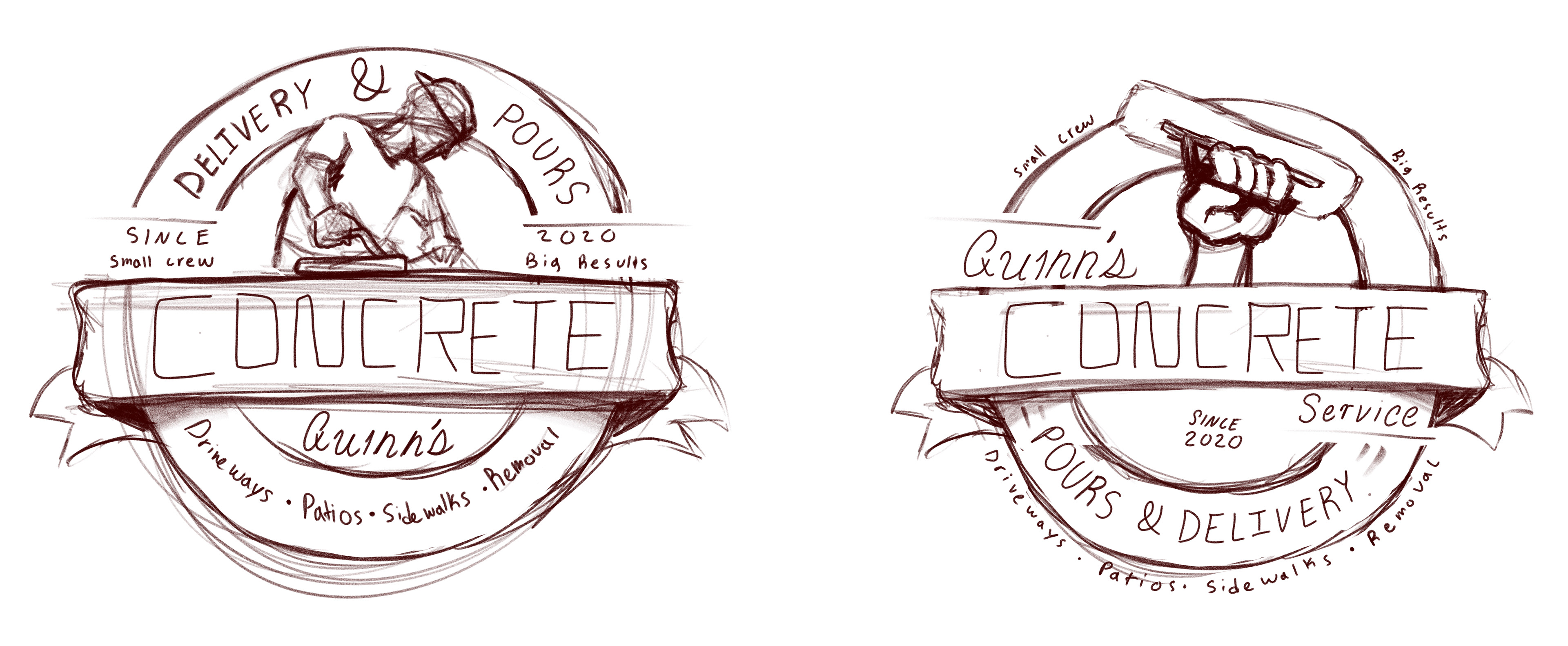
This part of my process demonstrates how I used a reference photo of my brother in Adobe Fresco to build the illustration. Drawing on my background in screenprinting, I vector-traced the image using a style specifically optimized for the print medium. Because I understand the technical constraints of print production, I was able to create a design that looks visually complex but remains fundamentally simple and efficient to expose and print.